QueueLess
A mobile queuing experience designed to reduce uncertainty, unnecessary waiting, and crowded service locations.
- Role
- Sole designer — research framing, flows, wireframes, UI, prototype
- Discipline
- UX design · UI design · Prototyping
- Platform
- Mobile app (iOS & Android concept)
- Tools
- Figma, Auto Layout, Interactive prototyping
Designed end to end and tested informally. Usability findings changed the design; no quantitative metrics were recorded.
View prototype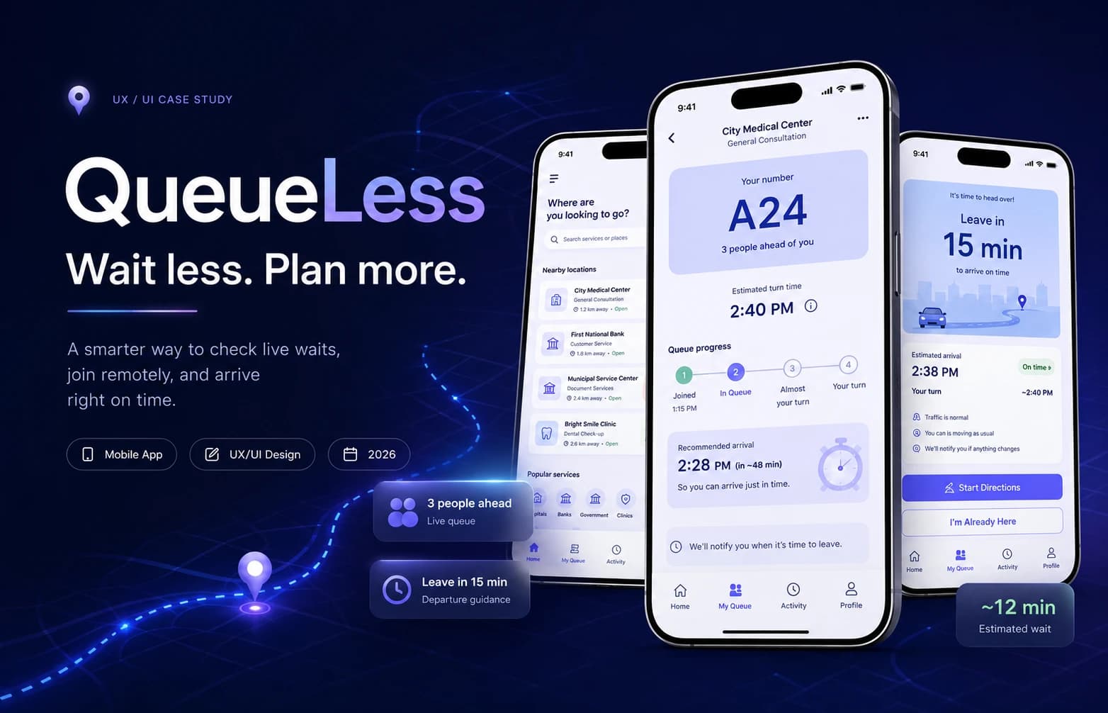
Overview
Context
Clinics, government offices, banks and service counters in Lebanon still run on physical presence. You take a paper ticket, or you take a chair, and then you wait without information.
Problem
The cost of queuing is not only the wait — it is the uncertainty. Because nobody can see how long a queue really is, people arrive far too early, stay in the room to avoid losing their place, and the space fills up with people who did not need to be there yet.
Objective
Let someone join a queue from wherever they are, watch it move in real time, and arrive when they are actually needed.
What I did
- Framed the problem and mapped the end-to-end service journey
- Designed the flows, information architecture, and screen states
- Built the UI system and the interactive Figma prototype
- Ran informal usability sessions and reworked the design from what they showed
The challenge
A queue is a shared resource that nobody can see.
Every person in a waiting room is solving the same problem alone: am I about to be called, or do I have an hour? With no answer, the rational move is always to show up early and stay put. Multiply that by everyone, and the room fills with people whose turn is nowhere near.
someone taking unpaid hours off work, a parent with a child. A wasted morning is not a minor inconvenience for them.
So the design problem was: what has to be true for someone to feel safe leaving the room?
Research and discovery
Grounded in observed behaviour, not a survey.
This project began from direct observation of how queuing works in local service locations: early arrival, physical place-holding, and repeated checking with staff.
The assumption that mattered most: people will only leave a queue if leaving cannot cost them their place.
What shaped the design
Four conclusions that each changed a screen.
- 01
Uncertainty costs more than waiting
The interface leads with position and progress, not with a promise about saved time.
- 02
Leaving must be safe
If there is any doubt that stepping out could forfeit your turn, nobody steps out. Queue position is persistent.
- 03
Choosing where to go is part of the wait
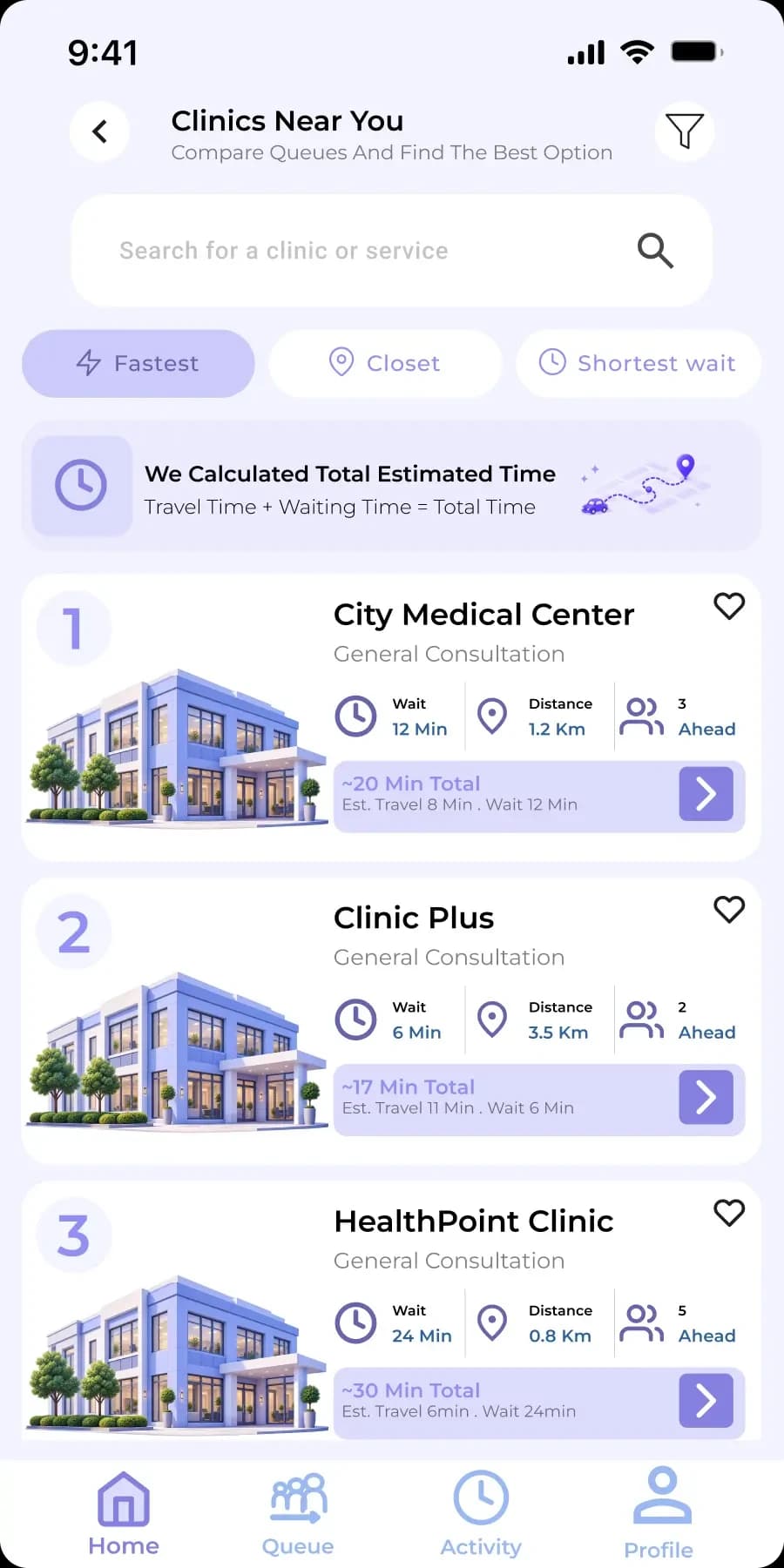
When two branches offer the same service, the shorter queue is the better product.
The core journey
Six steps, each one reversible except the last.
- 01
Discover
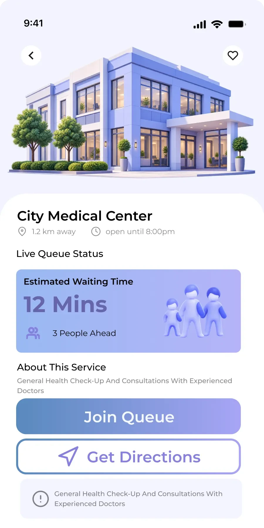
Find services nearby, with current queue conditions.
- 02
Compare
how far, and how long.
- 03
Join
Take a place in the queue remotely.
- 04
Track
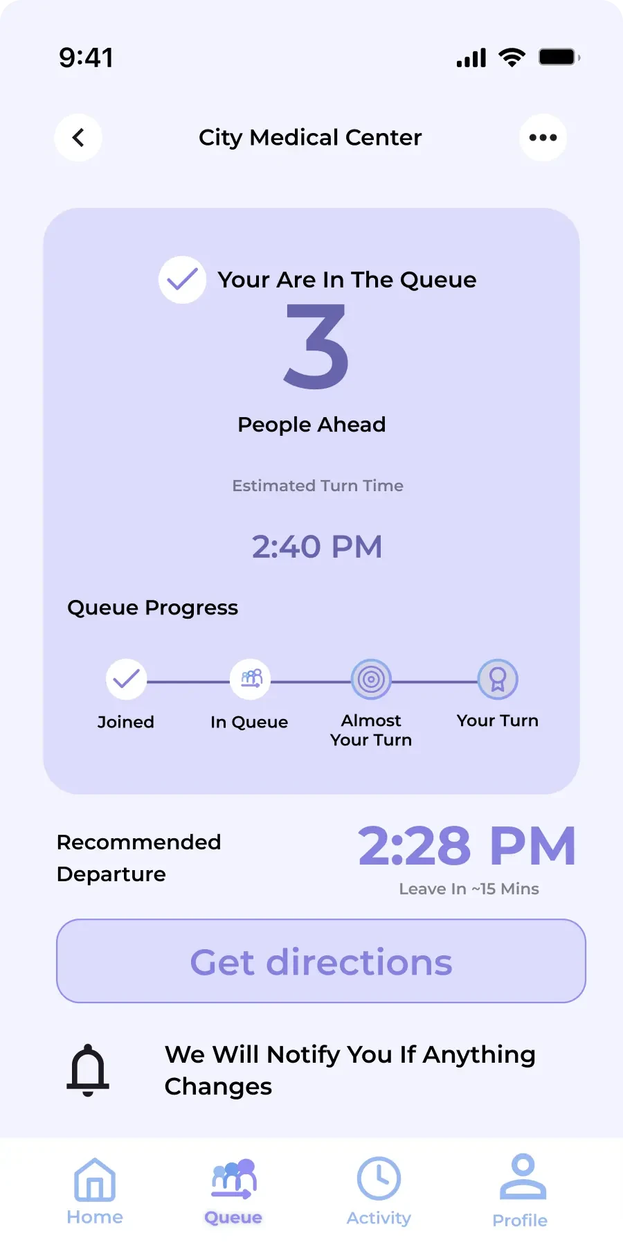
Watch the queue move in real time, with position and progress always on screen — no refresh, no re-checking.
- 05
Leave
Step away with the place held. The state travels with the person instead of with the chair.
- 06
Arrive
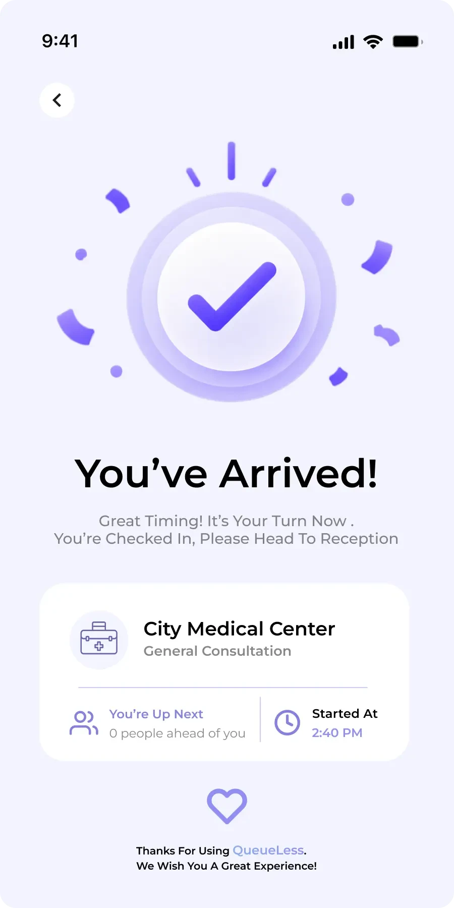
Get called back in time, with directions to the specific counter or room.
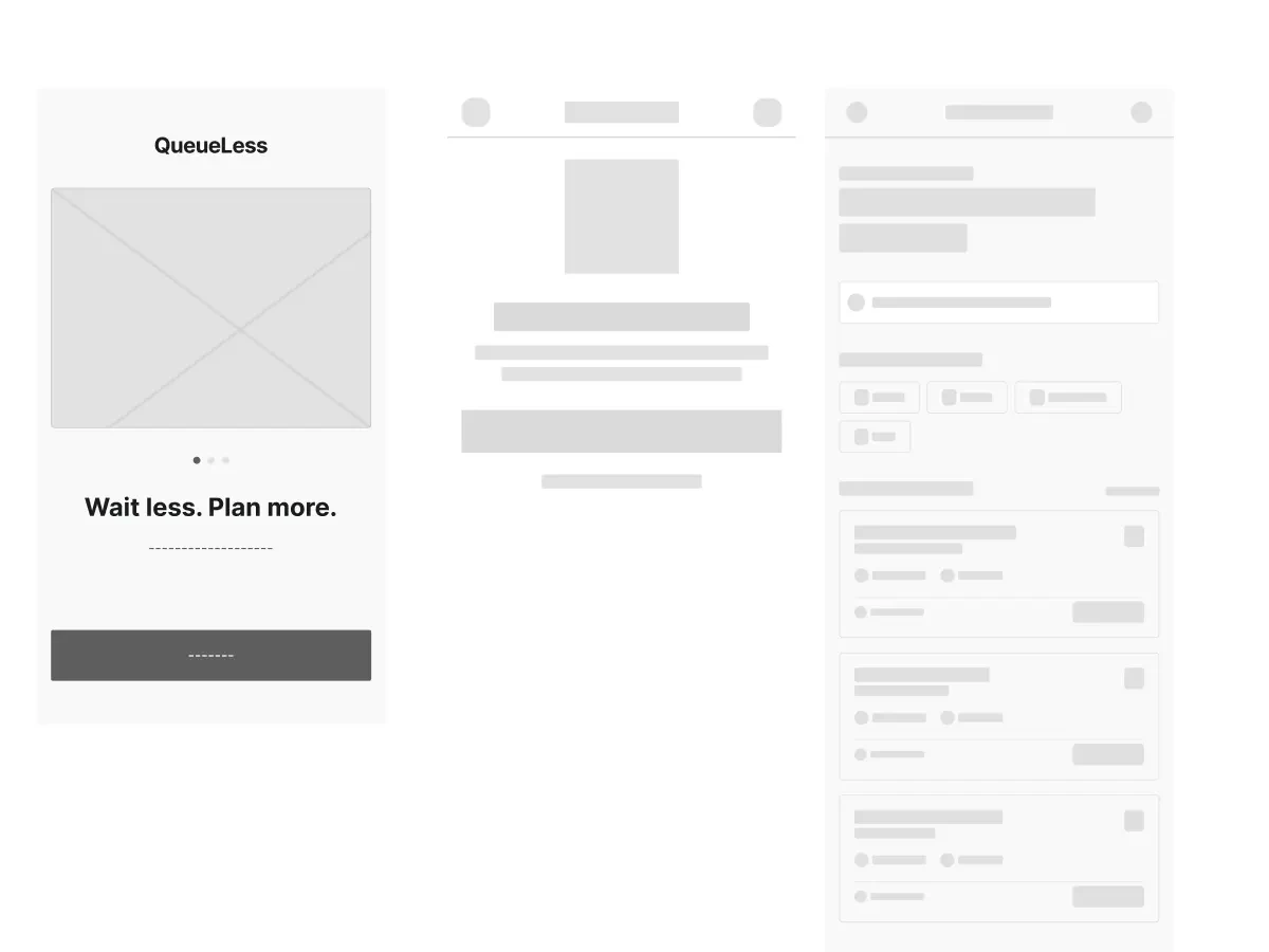
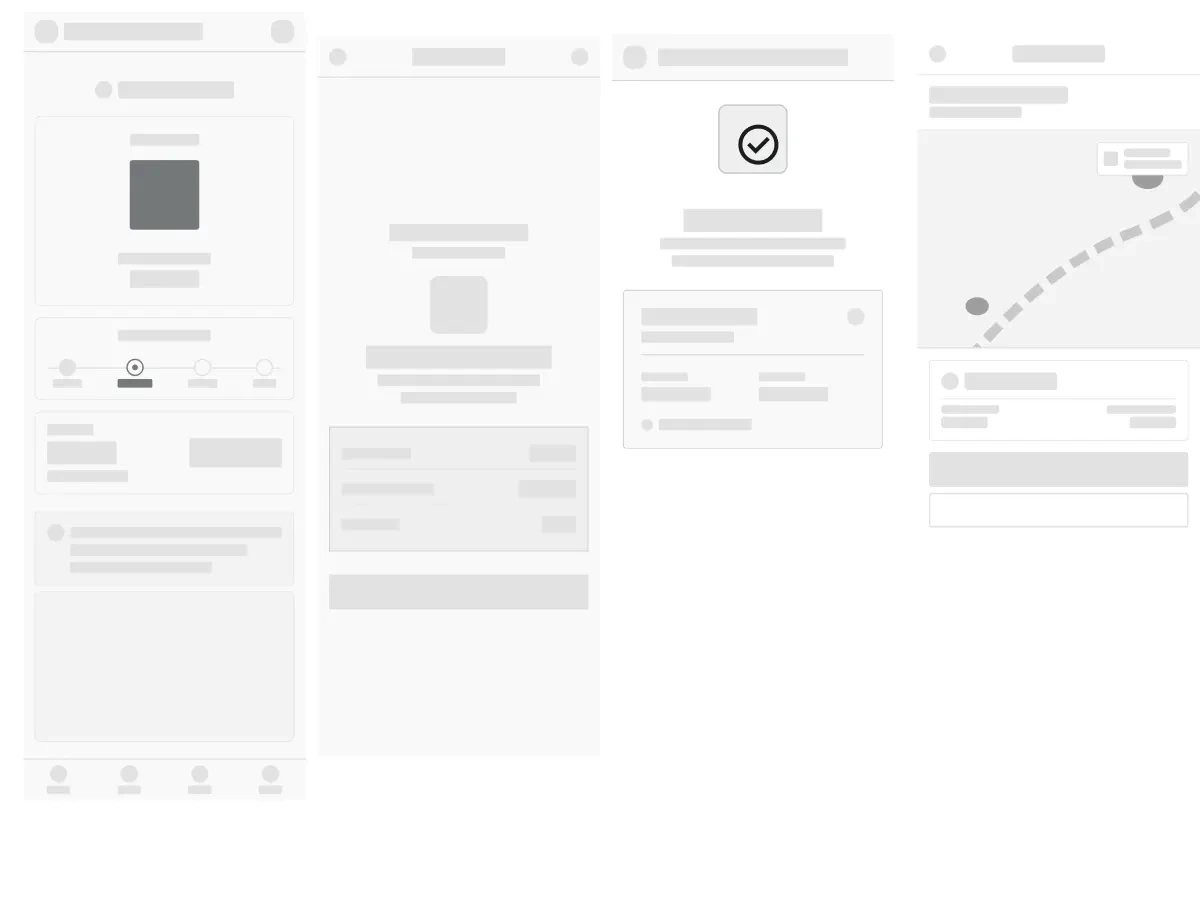
Wireframes and exploration
Structure resolved in low fidelity, before any colour decisions.
Key design decisions
Each of these had a credible alternative that was rejected for a reason.
Show queue position.
- Evidence
- A precise “12 minutes remaining” is a promise the system cannot keep — one slow appointment breaks it, and a broken estimate destroys trust in everything else on screen.
- Alternative considered
- A live countdown timer as the primary display.
- Decision
- Position in the queue is the hero, with a time range as clearly secondary supporting information.
- Trade-off
- Less immediately satisfying to read, but it degrades honestly instead of becoming a lie the moment reality slips.
Comparison before commitment
- Evidence
- If the app only lets you join the branch you already chose, it has automated the ticket but left the actual decision — where to go — unsupported.
- Alternative considered
- Join first, switch later.
- Decision
- Comparison is a first-class step, sitting between discovery and joining.
- Trade-off
- Adds a step for someone who already knows where they are going, mitigated by making it skippable.
Arrival treated as a separate stage
- Evidence
- Being called is not the same as knowing where to go. The gap between the two is where a saved wait gets spent anyway.
- Alternative considered
- w
- Decision
- w
- Trade-off
- w
The final experience
The flow as it stands: discover, join, track, arrive.
Design system
Built to stay legible in a bright waiting room, at arm’s length, in a hurry.
Typography
- One sans-serif family across the product, with weight, carrying hierarchy
- Queue position set at display scale: readable at a glance without focusing
Colour
- A restrained neutral base, so status colour means something when it appears
- A single accent reserved for the active queue state and the primary action
Components
- Service row: name, distance, and live queue condition in one scannable unit
- Queue card: position, progress, and the single primary action for the current state
- Status pill: reused across joined, waiting, called, and completed states
- Action bar: one dominant control, with secondary actions visually demoted
Interaction states
- Every interactive element specified for default, hover, focus, pressed, and disabled
- Loading and empty states designed rather than left to chance
- Destructive actions such as leaving a queue always require explicit confirmation
Outcome and reflection
QueueLess resolves into a complete, coherent mobile flow: someone can find a service, compare where to go, take a place remotely, watch it move, step away safely, and be guided back at the right moment.
Testing and iteration
two problems the prototype exposed, and what changed because of them.
Timing logic did not hold up. The earliest version implied a precision the underlying system could never deliver. It was reworked so that position leads and time is expressed as a range — a claim the design can actually keep.
Competing actions caused hesitation. Presenting several actions at equal weight made people stop and re-read, particularly around leaving a queue. Each state was reduced to one clear primary action.
Contact
Have a product idea worth shaping?
I’m open to UI/UX and product design roles, and to freelance design and frontend projects. Tell me what you’re working on.