Cinema Booking
A mobile cinema-booking experience that helps moviegoers discover films, select a showtime and seat, and access their ticket in one place.
- Role
- Sole designer — visual system, screen design, booking flow
- Discipline
- UI design · Interaction design
- Platform
- Mobile app
- Tools
- Figma, Auto Layout, Component variants
A concept project. It has not been released, and no user testing has been carried out on it.
Film posters and stills in these screens are third-party promotional imagery used as placeholder reference content. They are not original artwork, and would be replaced with licensed or original assets in any released product.
View prototype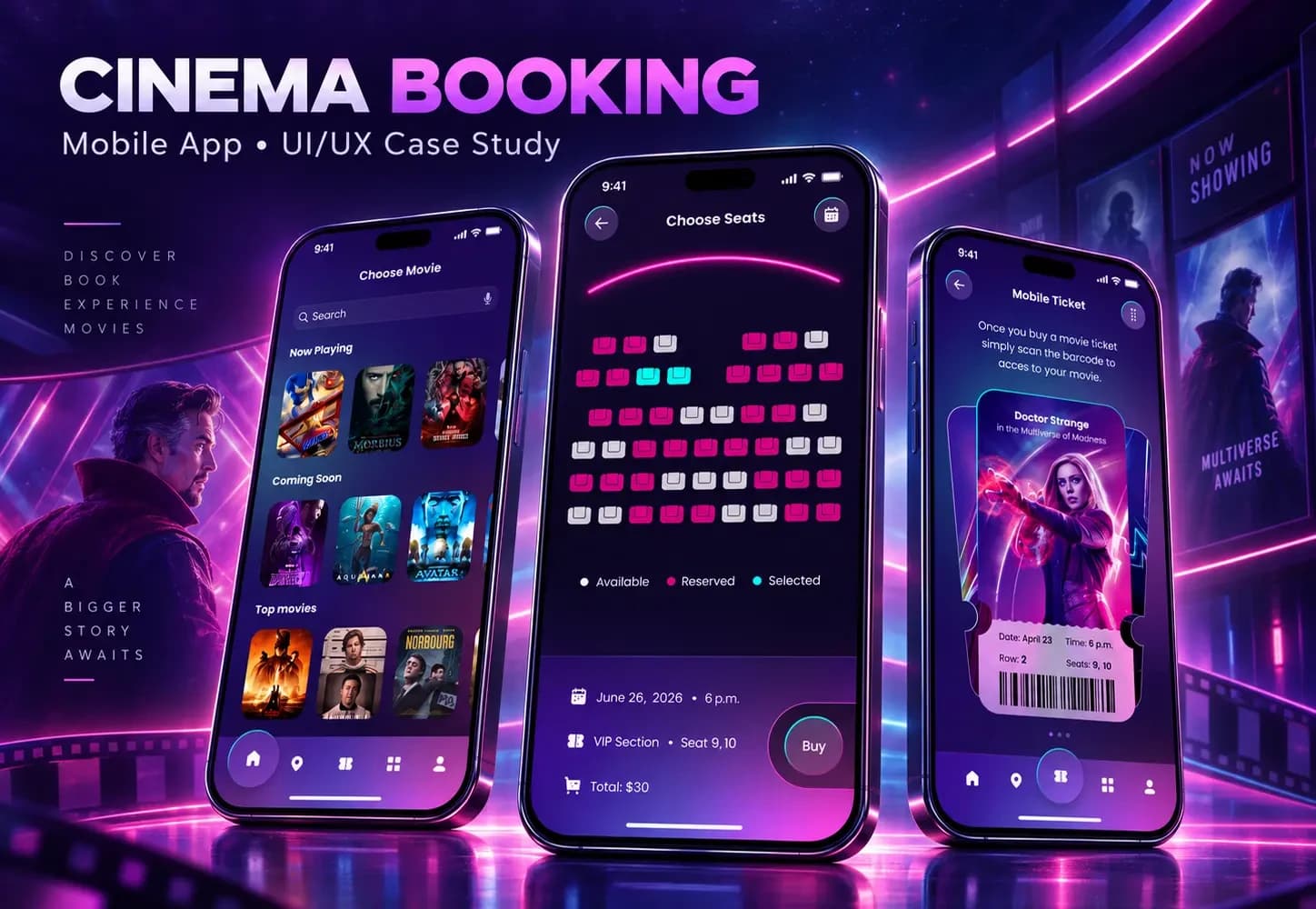
Overview
Context
Booking a cinema seat is a short, high-intent task with a surprising amount of friction: the ticket usually ends up as a screenshot in a camera roll.
Problem
The steps are simple individually, but they are rarely designed as one continuous experience.
Objective
Design a single, cohesive flow from discovery through to a ticket that actually belongs in the app.
What I did
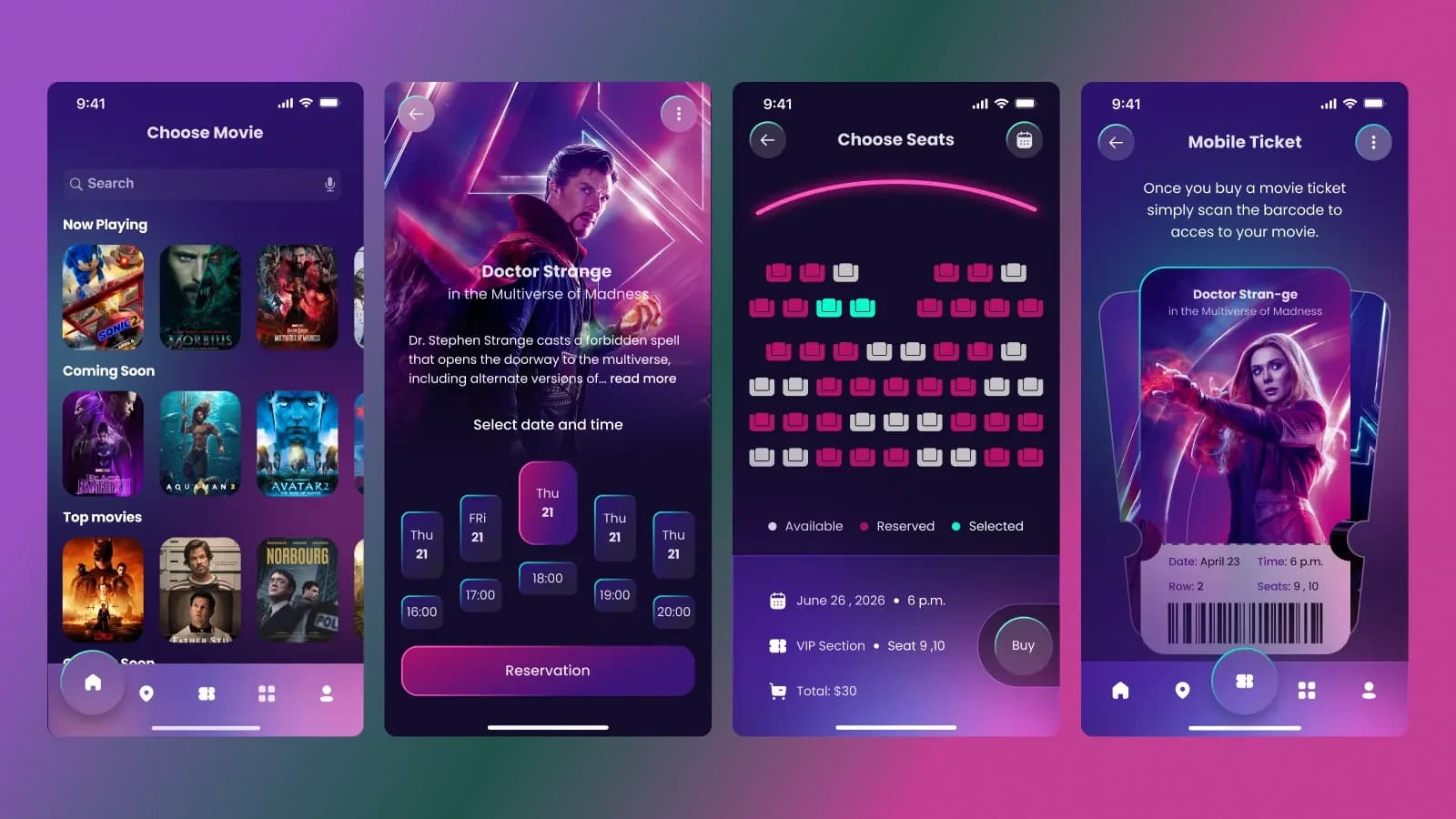
- Designed the end-to-end booking flow and its screen states
- Built the cinematic visual system: type scale, colour, elevation, and component variants
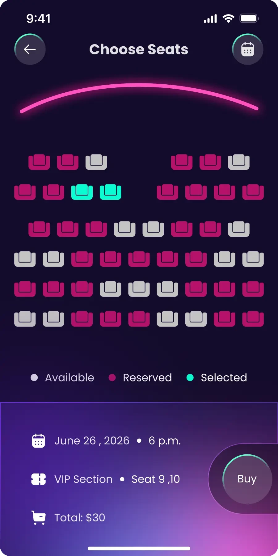
- Designed the seat-selection interface and its selected and unavailable states
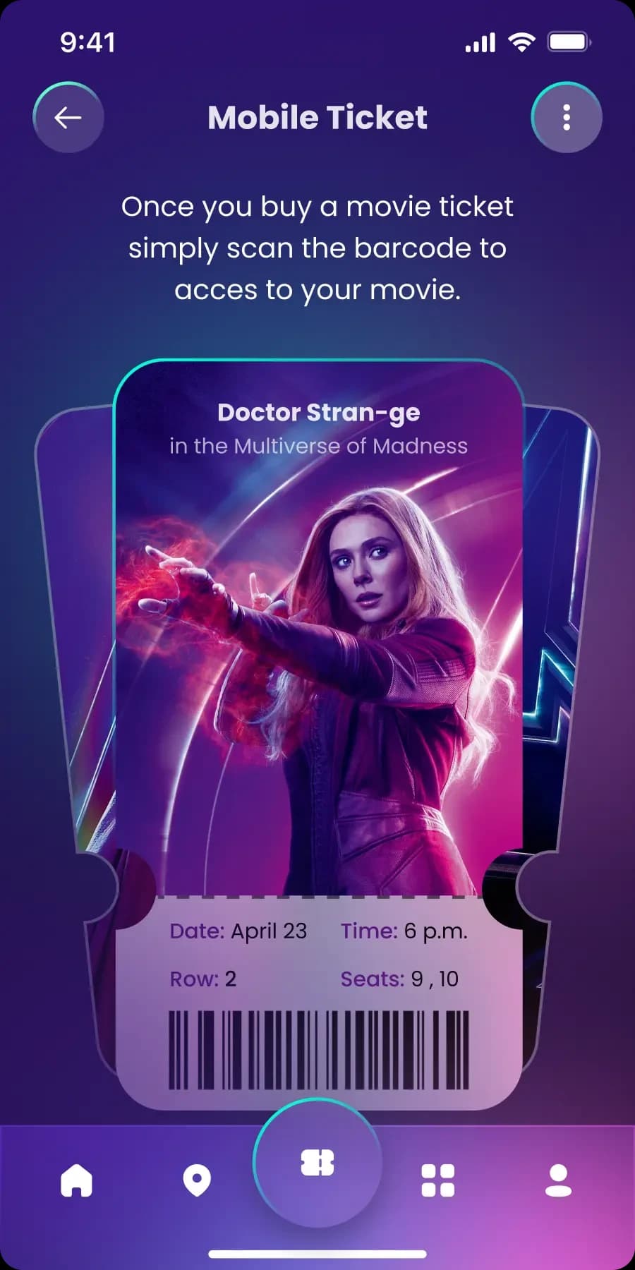
- Designed the mobile ticket as a distinct, recognisable component
The challenge
Content-heavy discovery, then a precision task, in the same app.
The two halves of this product pull in opposite directions. Discovery wants to be immersive. Seat selection wants to be the opposite: precise, because picking the wrong seat is a real cost.
A single visual system has to serve both. The interesting question is how to move between them without the app feeling like two different products stitched together.
The thinking behind it
Design positions taken deliberately.
- 01
Let the artwork carry the atmosphere
Film imagery is already the most expressive element on screen. The interface stays dark and quiet so the posters supply the mood, instead of competing with them.
- 02
Selected states must be unmistakable
In a booking flow the user is repeatedly asked to commit , a date, a time, a seat.
- 03
The ticket is the product’s memory
It is the one screen reopened later, in a queue, in low light. It was designed as its own component with its own hierarchy rather than as a receipt.
- 04
Density belongs only where it is needed
The seat map is the single dense screen in the app.
The booking flow
Four commitments, each one clearly confirmed before the next.
- 01
Discover
Browse available movies, with enough metadata to decide without opening every title.
- 02
Choose
Open a film for detail, and the information that decides whether to book.
- 03
Schedule
Pick a date and a showtime, with the selected state making the current choice obvious at a glance.
- 04
Seat
Select from a seat map that distinguishes available, taken, and selected.
- 05
Ticket
The booking becomes a ticket that lives in the app.
The screens
Discovery, film detail, showtime selection, seat map, and ticket.
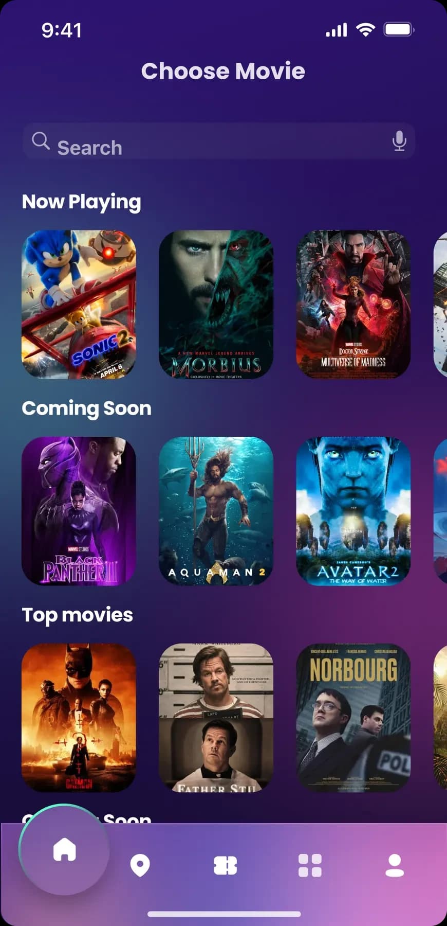
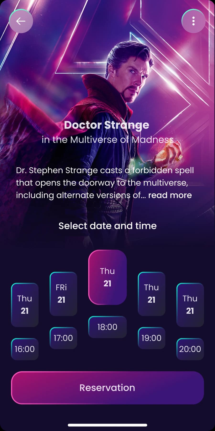
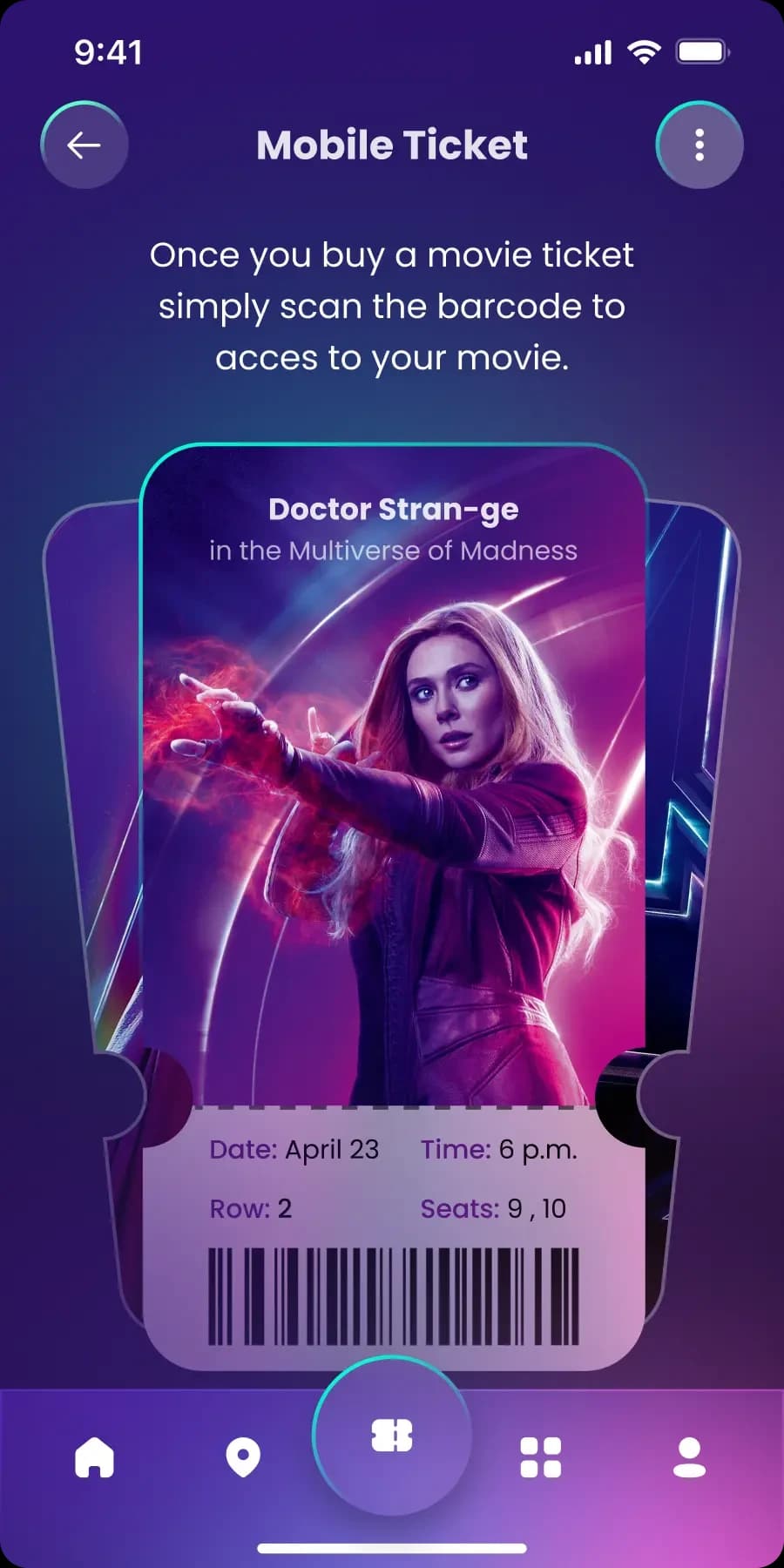
The mobile ticket
Design system
A dark, cinematic direction built to sit underneath other people’s artwork.
Typography
- Poppins family, with weight carrying hierarchy on dense screens
- Film titles set large; supporting metadata held small and consistent
- Numerals — times, seat numbers, row letters — kept tabular so they align
Colour
- A deep purple base that recedes behind poster artwork rather than fighting it
- One accent, reserved exclusively for the current selection and primary actions
- Seat states distinguished by fill, border, and label — never by hue alone
Components
- Film card: poster, title, and the minimum metadata needed to choose
- Time chip: default, selected, and unavailable variants
- Seat: available, selected, taken, and unavailable variants
- Ticket: a distinct surface with its own elevation and internal hierarchy
Interaction states
- Selected states share one treatment across dates, times, and seats
- The primary action stays disabled until the current step is actually complete
- Unavailable options remain visible rather than hidden, so the layout stays stable
Outcome and reflection
What this project demonstrates is interface craft: a coherent dark visual system, a genuinely distinctive ticket component.
What it is missing, honestly, is the front half of a UX case study. There is no research here, and no validation.
Contact
Have a product idea worth shaping?
I’m open to UI/UX and product design roles, and to freelance design and frontend projects. Tell me what you’re working on.