EchoMap
A private location-based memory journal that helps people connect personal stories with the places where they happened.
- Role
- Sole designer — concept, product thinking, flows, UI, prototype
- Discipline
- UX design · UI design · Product thinking
- Platform
- Mobile app
- Tools
- Figma, Auto Layout, Interactive prototyping
A design concept, developed end to end. No user research or usability testing has been conducted.
View prototype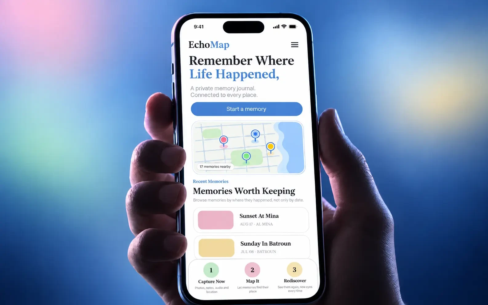
Overview
Context
A photo of a place is not the same as the memory of it. The camera roll keeps the image and loses everything around it — who was there, what it felt like, why it mattered. Meanwhile the platforms designed for memories are built for audiences, not for the person remembering.
Problem
There is no comfortable place to keep something personal that is tied to a location. Journals are not spatial. Social apps are not private. Photo libraries are chronological, and a life is not.
Objective
Design a private space where a memory lives at the place it happened, and comes back on its own terms.
What I did
- Defined the product concept and who it is for
- Designed the capture, storage, and rediscovery flows
- Built the interface system and interactive prototype
Who it is for
People roughly 18–35 who want somewhere private to keep what a place meant.
The audience is people who already document their lives. They want the act of keeping a memory without the performance of publishing one.
The challenge
Rediscovery is the feature, and also the risk.
The whole idea rests on memories coming back to you when you are near the place they belong to.
It is also the part that can hurt. Not every memory is one you want surfaced unprompted. An app that cheerfully announces a memory is near you outside the wrong building has done real harm with a feature it thought was delightful.
So the central design problem was how to let users make rediscovery something, without making them configure a settings panel to feel safe.
The principles it is built on
Product positions, arrived at by reasoning through the failure cases.
- 01
Private by default, with no path to public
Memories are private at rest and there is no sharing flow to accidentally fall into.
- 02
Capture must be nearly free
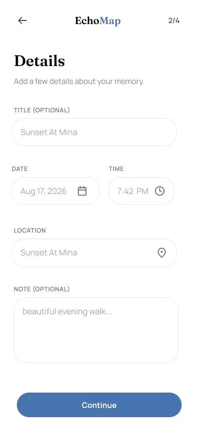
Place and date are detected automatically. If keeping a memory takes effort, it happens only on remarkable days — and the ordinary ones are the ones worth having later.
- 03
Rediscovery is offered, never imposed
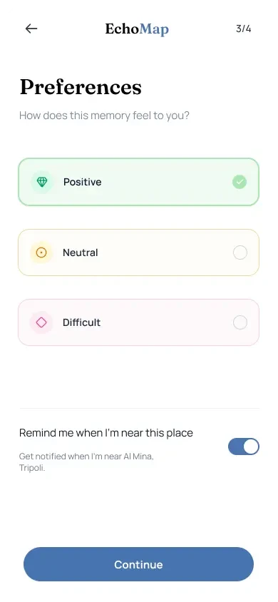
A proximity notification is an invitation. It can be dismissed, muted for a place, or turned off entirely, and the app does not ask again.
- 04
Some things need a locked drawer
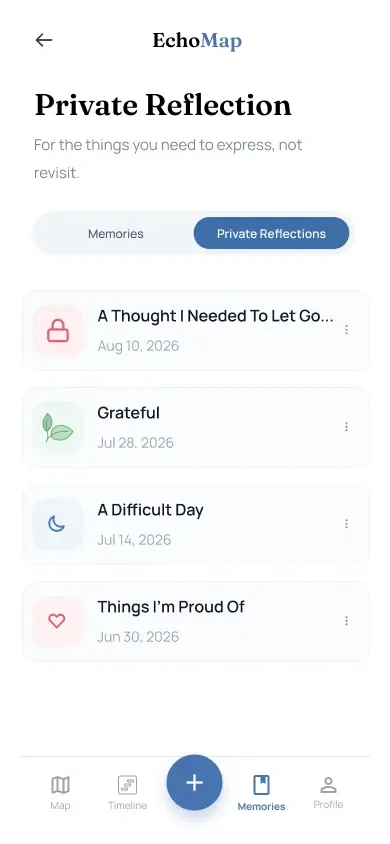
A separate private space holds sensitive entries, kept out of the main map and out of rediscovery altogether.
How it works
Capture, keep, and — only if wanted — return.
- 01
Arrive
The place and date are detected automatically, so a memory starts with its context already filled in.
- 02
Capture
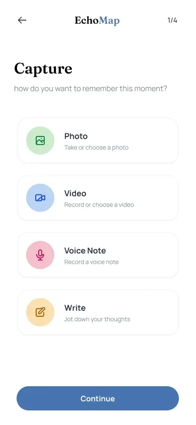
Write it, add photos, record audio or video, or capture live in the moment.
- 03
Keep
The entry is stored privately against its location. Sensitive entries can go to the private space instead.
- 04
Return
Passing nearby later, an optional notification offers what is there.
- 05
Control
Open it, dismiss it, mute this place, or suppress the memory from resurfacing.
Key design decisions
The ones that decide whether this product is safe to use.
Notifications reveal proximity, not content
- Evidence
- A notification is read on a lock screen, in public, by whoever is looking. Putting the memory in the preview leaks it to the room.
- Alternative considered
- Show a snippet or photo thumbnail to make the notification more enticing.
- Decision
- The notification says only that something is nearby. The content stays behind the app.
- Trade-off
- A less compelling notification, and probably a lower open rate. The right call for a private journal.
Suppression is separate from deletion
- Evidence
- Forcing a choice between meeting a painful memory and destroying it is a cruel piece of interaction design. Both options are wrong.
- Alternative considered
- Offer only delete, or only mute-everything.
- Decision
- Memories and places can be suppressed from rediscovery while remaining intact and reachable deliberately.
- Trade-off
- More states to design and explain, in exchange for the app never being the reason someone loses something.
No feed, no followers, no sharing
- Evidence
- Every social affordance changes what people are willing to write. The moment an audience is conceivable, entries become performances.
- Alternative considered
- Optional sharing, or a private-by-default feed.
- Decision
- The product has no social layer at all.
- Trade-off
- Gives up the growth that sharing brings. Keeps the only property that makes the product worth using.
The experience
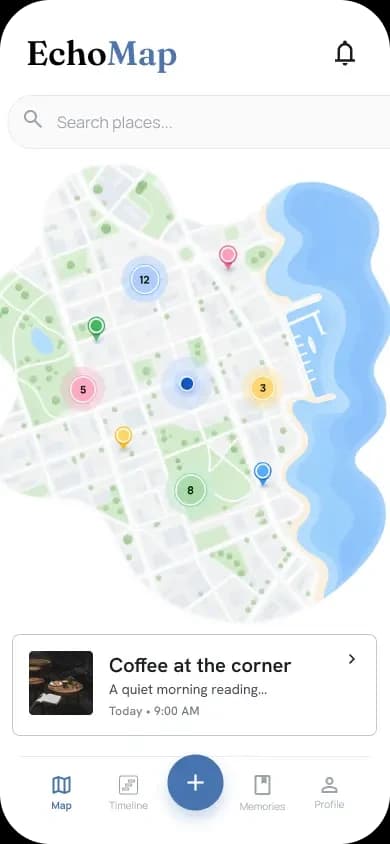
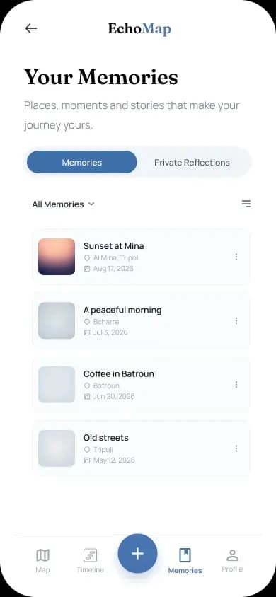
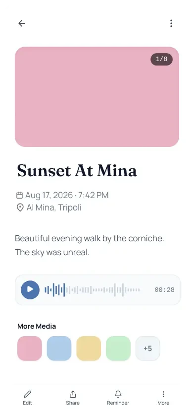
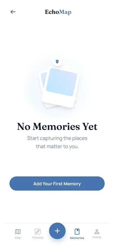
Eight screens: capture, the map, rediscovery, and the controls that keep it comfortable.
Visual system
Warm and quiet — a journal, not a dashboard.
Typography
- A warmer type pairing than a utility app would use, with room for longer writing
- Generous line height and a constrained measure, because entries are meant to be read
Colour
- A soft, low-contrast base that stays comfortable when reading at night
- Accent reserved for capture and for the current location on the map
Components
- Memory card: place, date, and an excerpt, with media indicated rather than previewed
- Map pin: single, clustered, and private-space variants
Interaction states
- Every suppression action is reversible, and says so at the point of use
- Empty states explain what the app will do with a memory before asking for one
Design concept
What has and has not been validated
EchoMap is a design concept. It has not been built or released.
Diary studies have been run on it. The audience described here is a design assumption.
The part I would most want to test is the language around suppression and the private space.
Outcome and reflection
EchoMap holds together: memory tied to place, kept private, returning only when it is welcome.
It also taught me to be suspicious of delight as a goal. The proximity notification is the most charming idea in the product and the one most likely to cause harm.

Contact
Have a product idea worth shaping?
I’m open to UI/UX and product design roles, and to freelance design and frontend projects. Tell me what you’re working on.